Program Used: Adobe Illustrator, Adobe Indesign, Adobe Photoshop
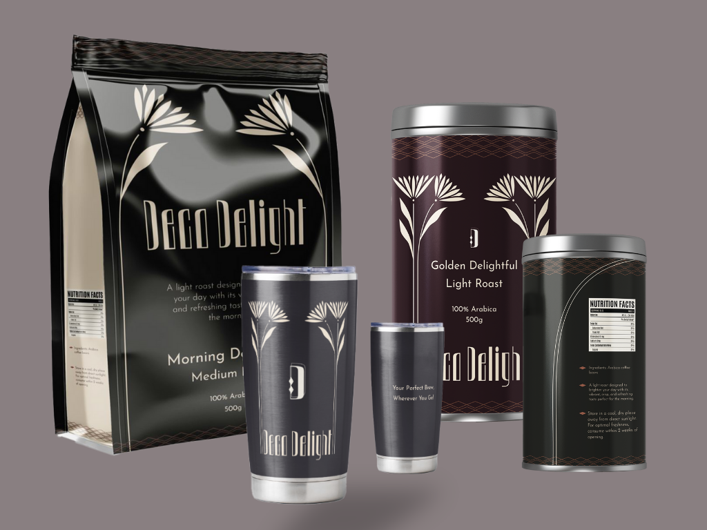
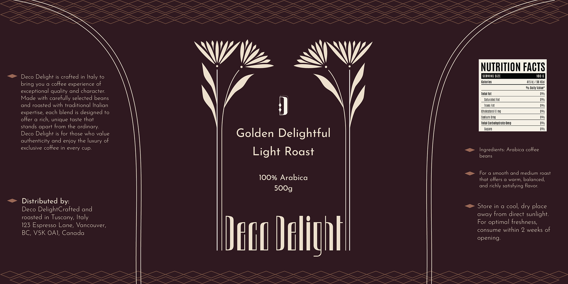
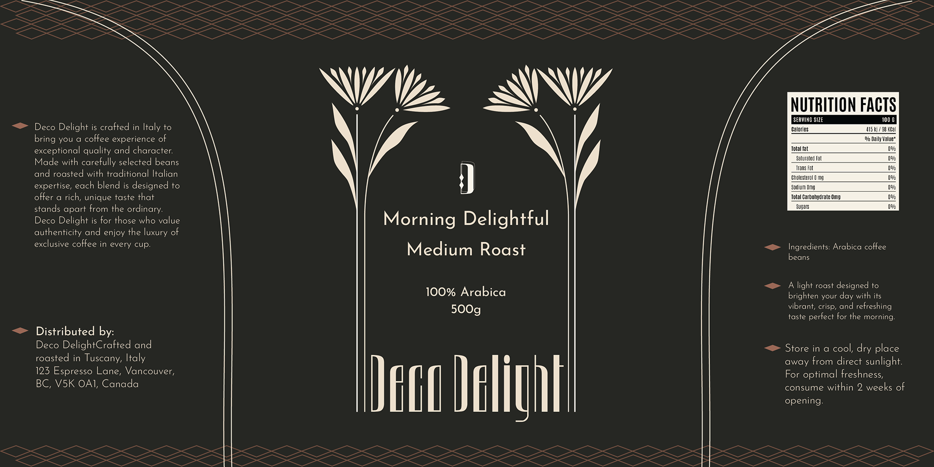
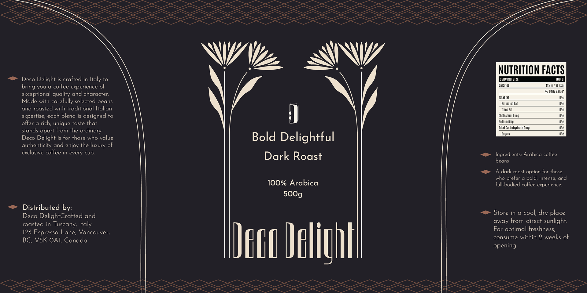
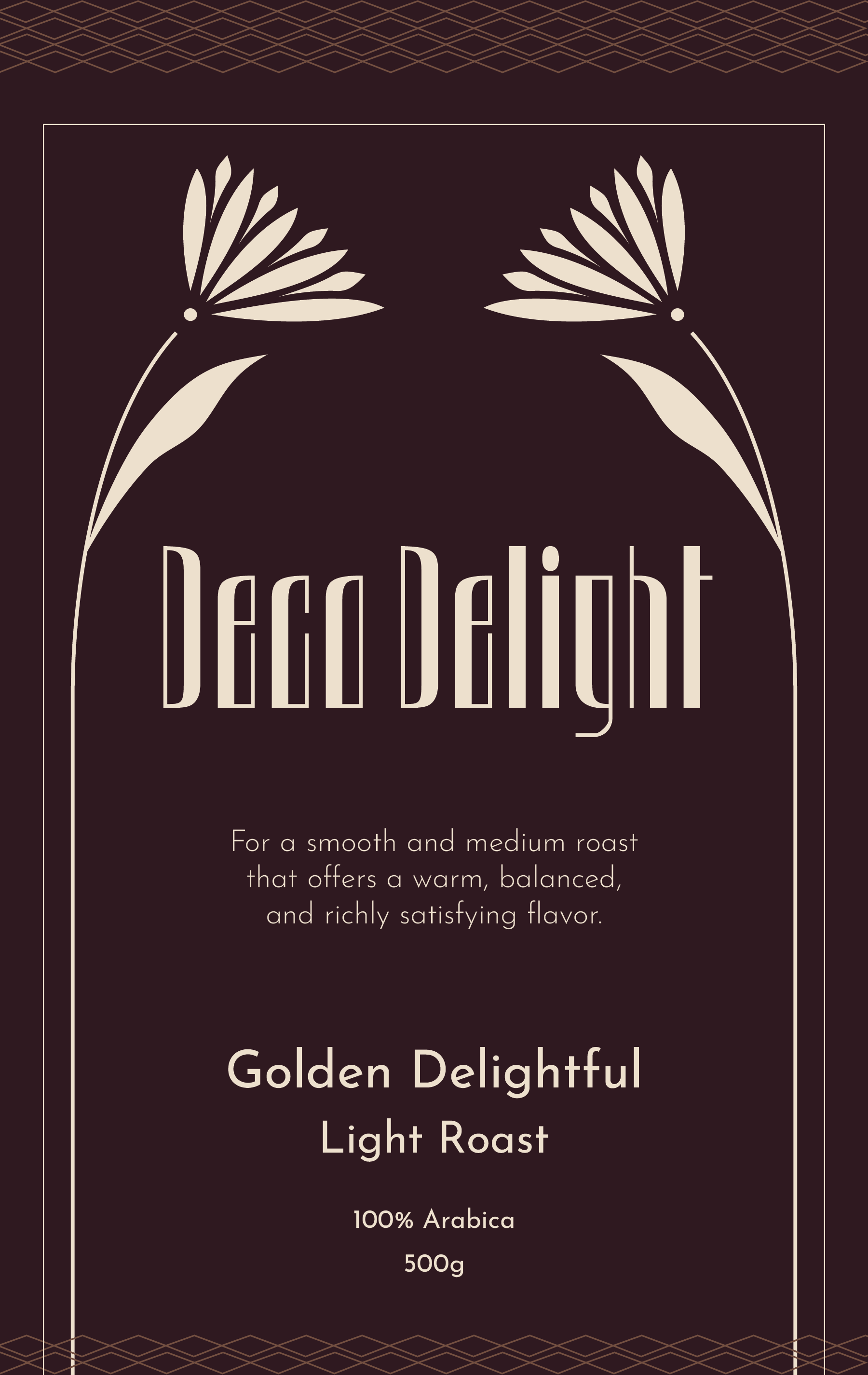
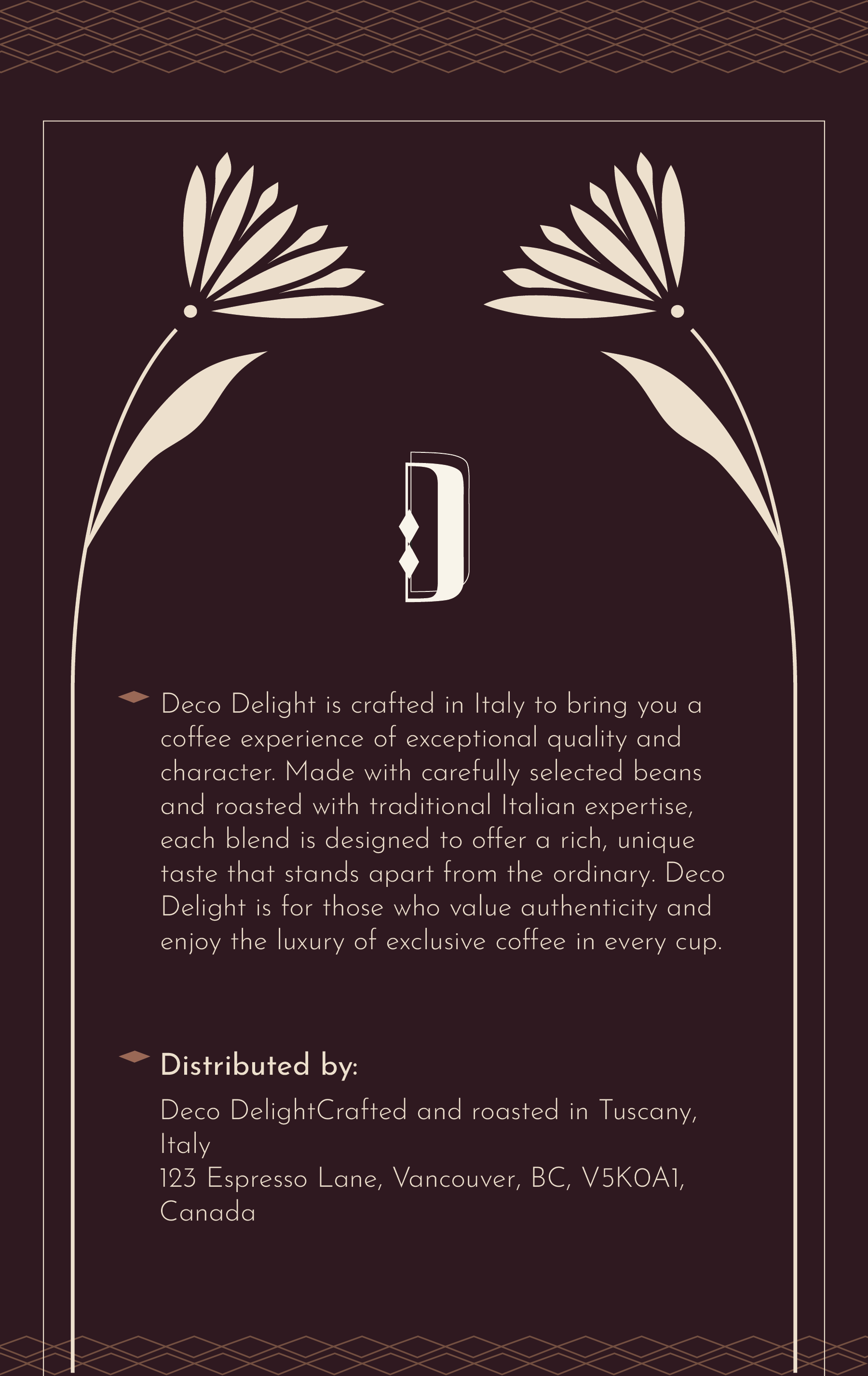
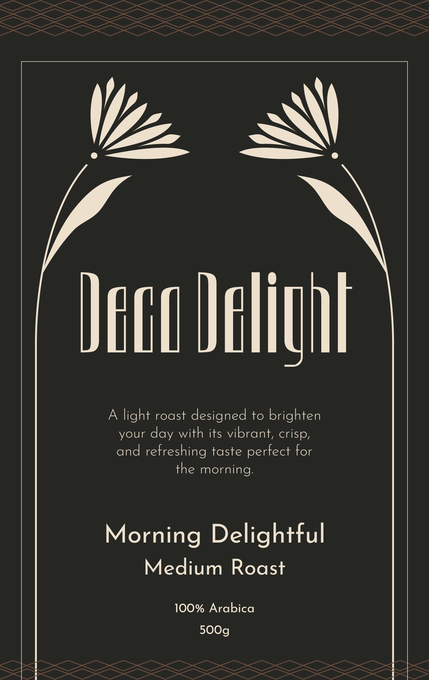
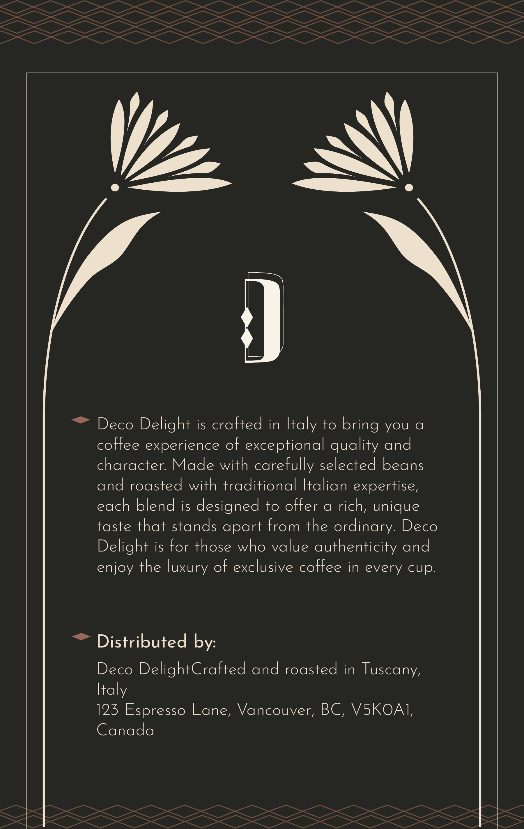
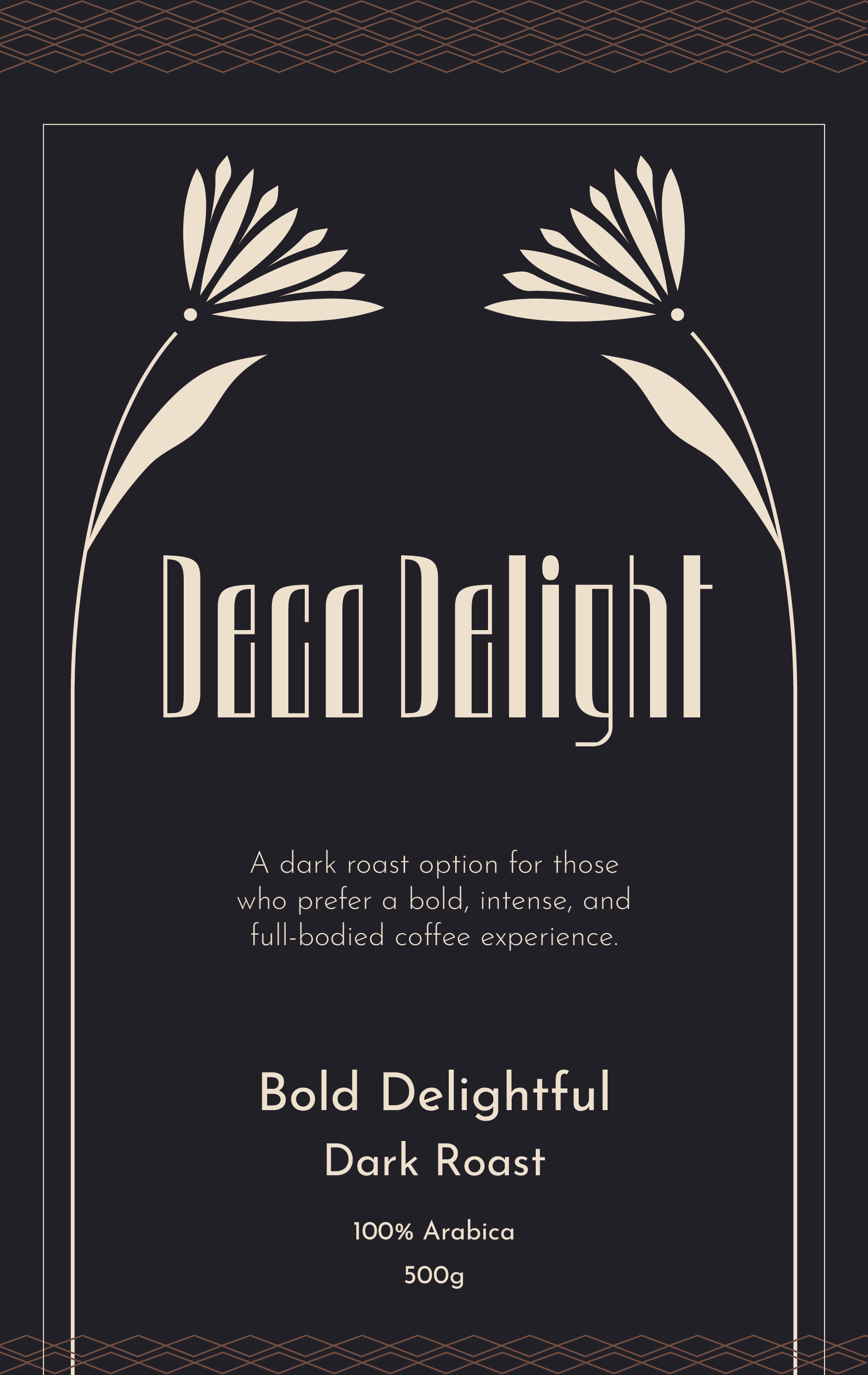
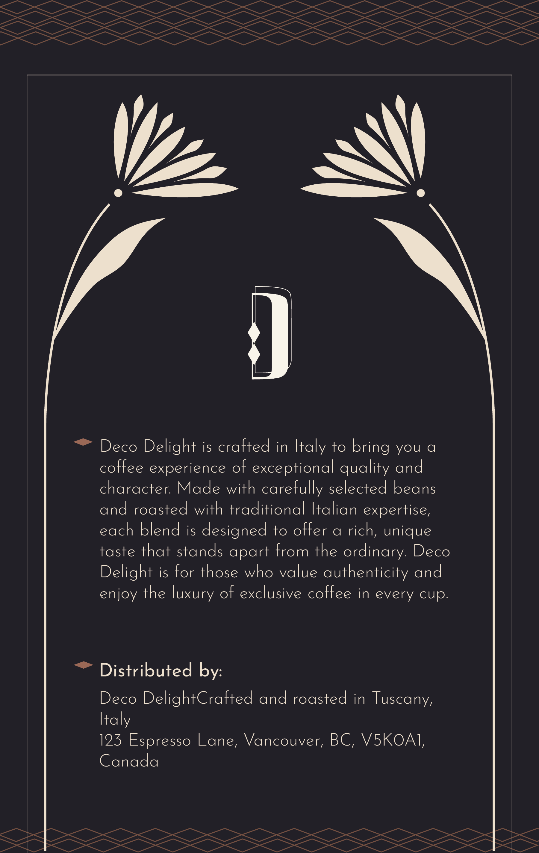
The Deco Delight packaging design captures the timeless elegance and sophistication of the Art Deco era, drawing inspiration from the artistic and cultural richness of 1920s Italy, where this exclusive coffee brand originates. A thoughtfully crafted every aspect of the design to reflect the essence of Italian luxury and artisanal craftsmanship, transporting consumers to a world of refined taste and high-end indulgence. The geometric patterns and intricate details mirror the bold, lavish style of the era, creating a visually striking experience that perfectly complements the exceptional quality of the coffee within.
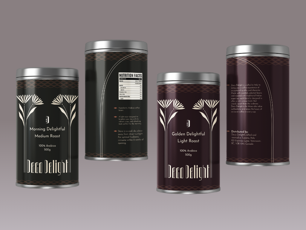
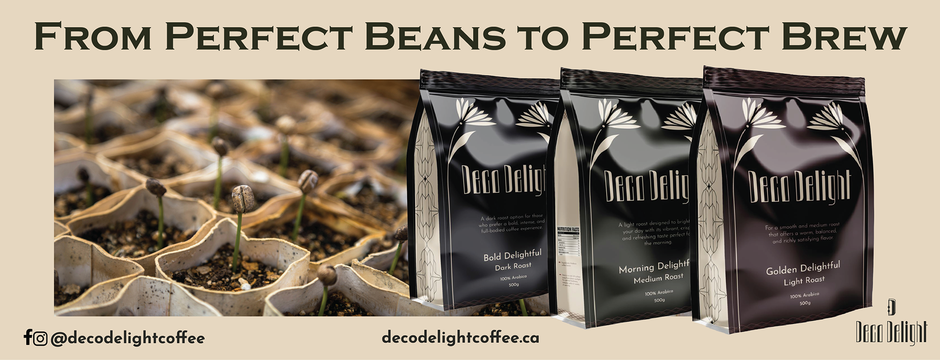
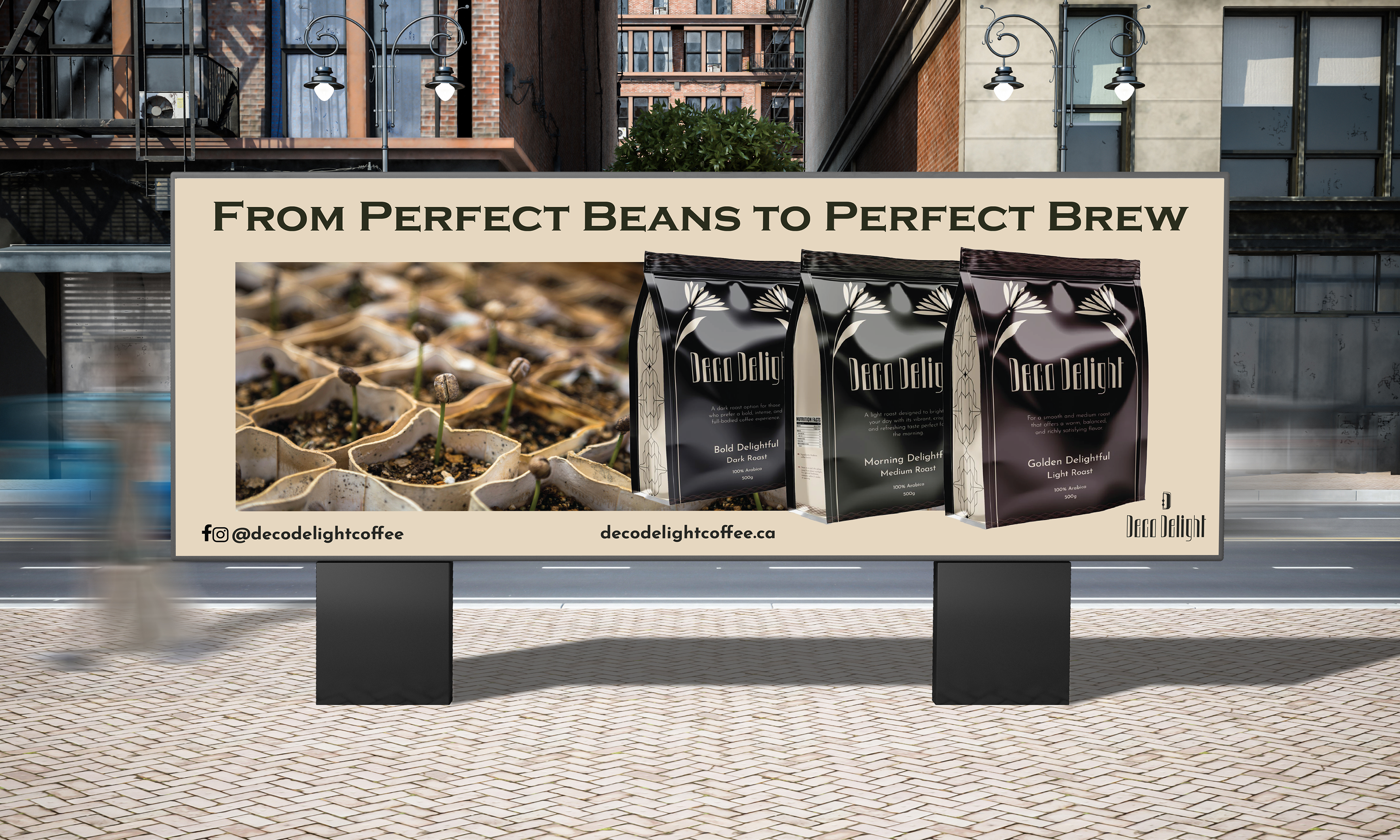
Deco Delight offers three distinct roasts, each tailored to satisfy different preferences. Golden Delightful is a medium roast, providing a smooth and balanced flavour. Bold Delightful is a dark roast, for those who enjoy a rich and intense flavor. While Morning Delightful is a light roast, with a vibrant and refreshing taste. This collection ensures that every coffee lover finds a unique and delightful experience worth savoring.
The deliverables I provided for this project were made through Adobe Illustrator, Adobe Indesign, and Adobe Photoshop. For this project, I was responsible for concept development, branding, packaging design, and marketing (which include: Two print billboards, landscape and portrait posters, and multiple Instagram ads.)
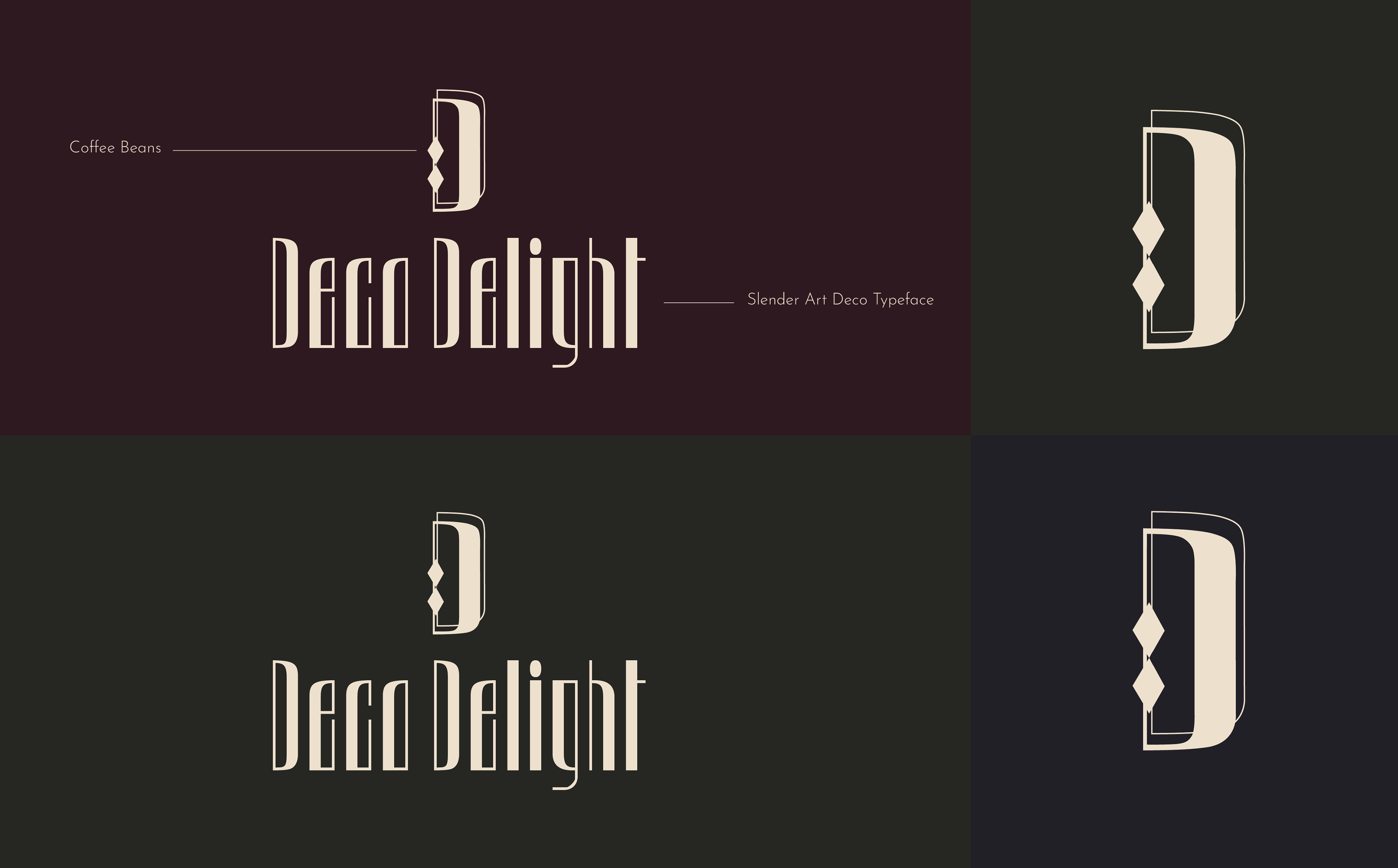
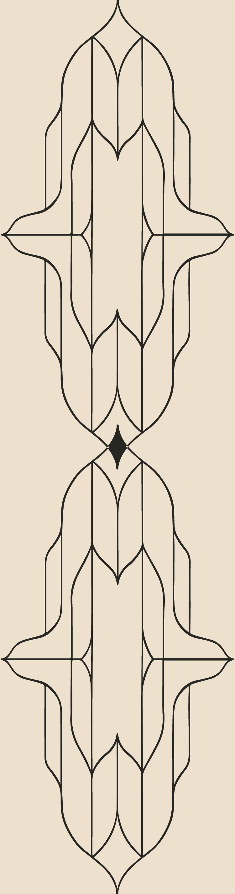
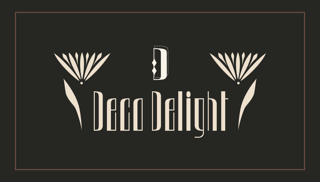
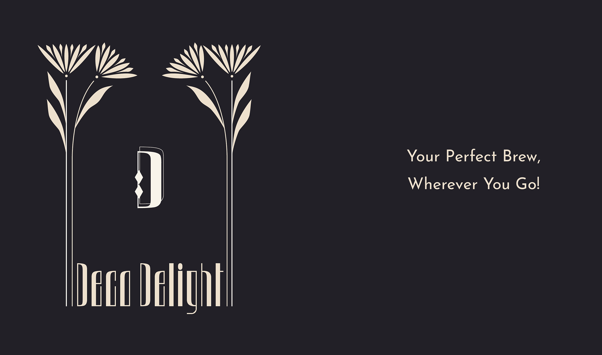
The inspiration for all of the designs –logo, shapes and patterns– come from the Art Deco era (1919-1939), which relied heavily on geometric shapes. The diamond shapes used around the packaging and within the brand’s logo are representative of coffee beans.
For my logo, I did multiple sketches, from paper sets to digital ones. Afterward, I selected the winning sketches, created vector files from them, and finished the final design within Adobe Illustrator.
Typography
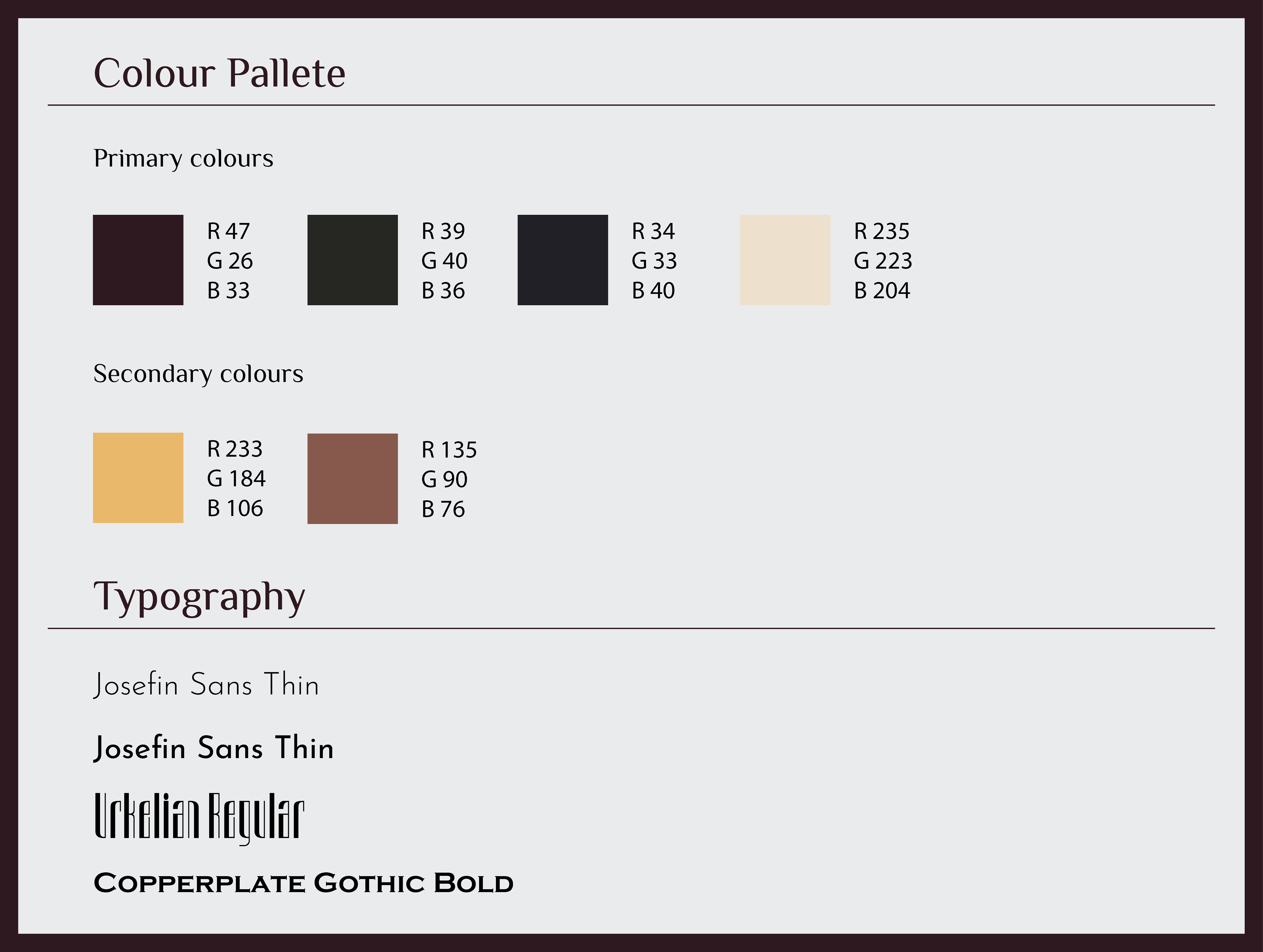
The main typeface I used is the sans-serif font, Josefin Sans Thin, both with light and regular weight. It represents the clean and modern design in comparison to the more classic Art Deco designs, which makes both the information and designs stand out next to each other.
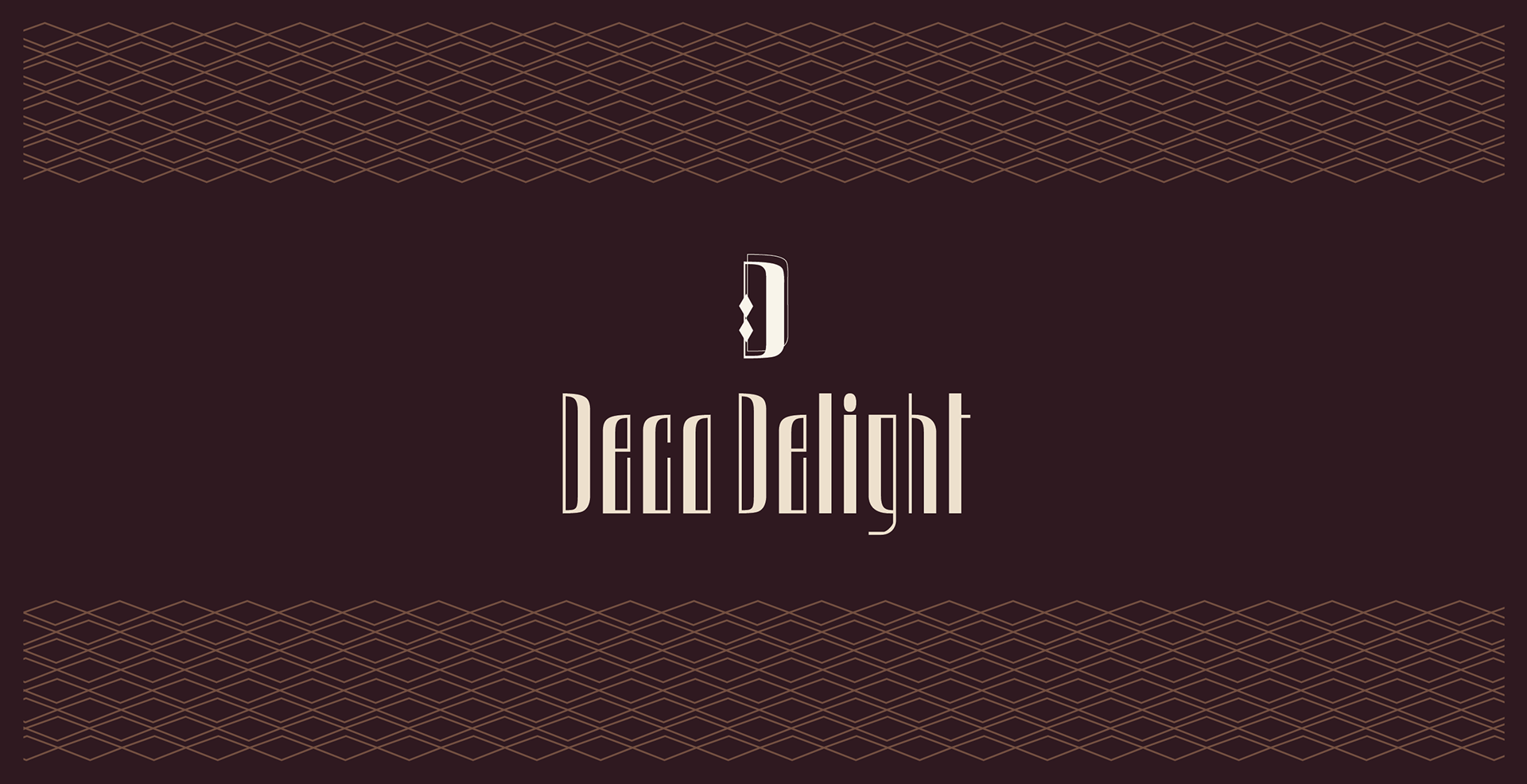
I used Urkelian Regular for the brand name and logo. It is a geometric, slender Art Deco typeface, where the letterforms and lines provide elegance and add personality to the concept.
The Serif font, Copperplate Gothic Bold was used for the billboard and Instagram ad copies, due to its bold and eye catching, while also having close sans-serif characteristics.
I used the dark shades of maroon, seaweed, and stone blue to add layers of warmth and tradition to my design, while the neutral buttercream fonts and gold accents stand out on top of the darker shades, giving it a more luxurious feel. This palette helps maintain the vintage style/feeling while keeping the modern elegant and luxurious designs.
Metal Tin Package
For the product’s packaging –including metal tins and paper bags– I chose geometric patterns representing coffee beans to set borders around the tops and bottoms.
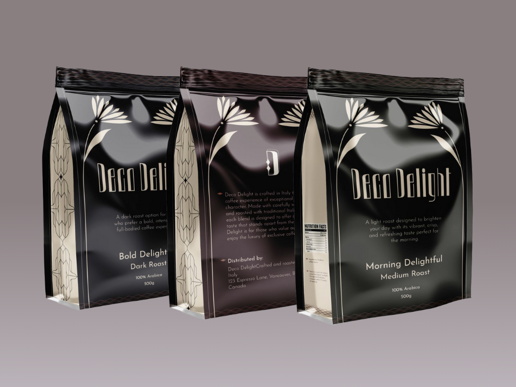
Paper Bag Package
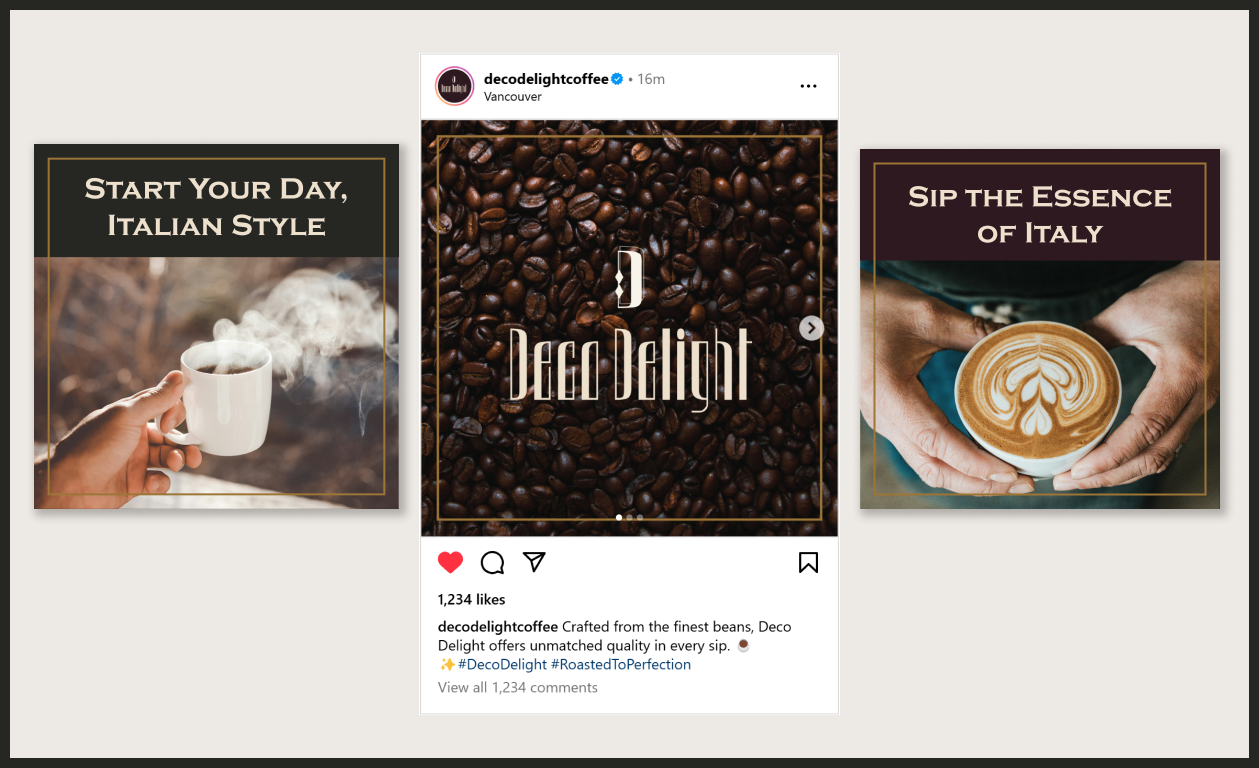
For the Instagram ads, I created a multiple-page ad, showcasing the company’s branding, its smell and quality, and the joy it brings, with a consistent brand identity and colour scheme.
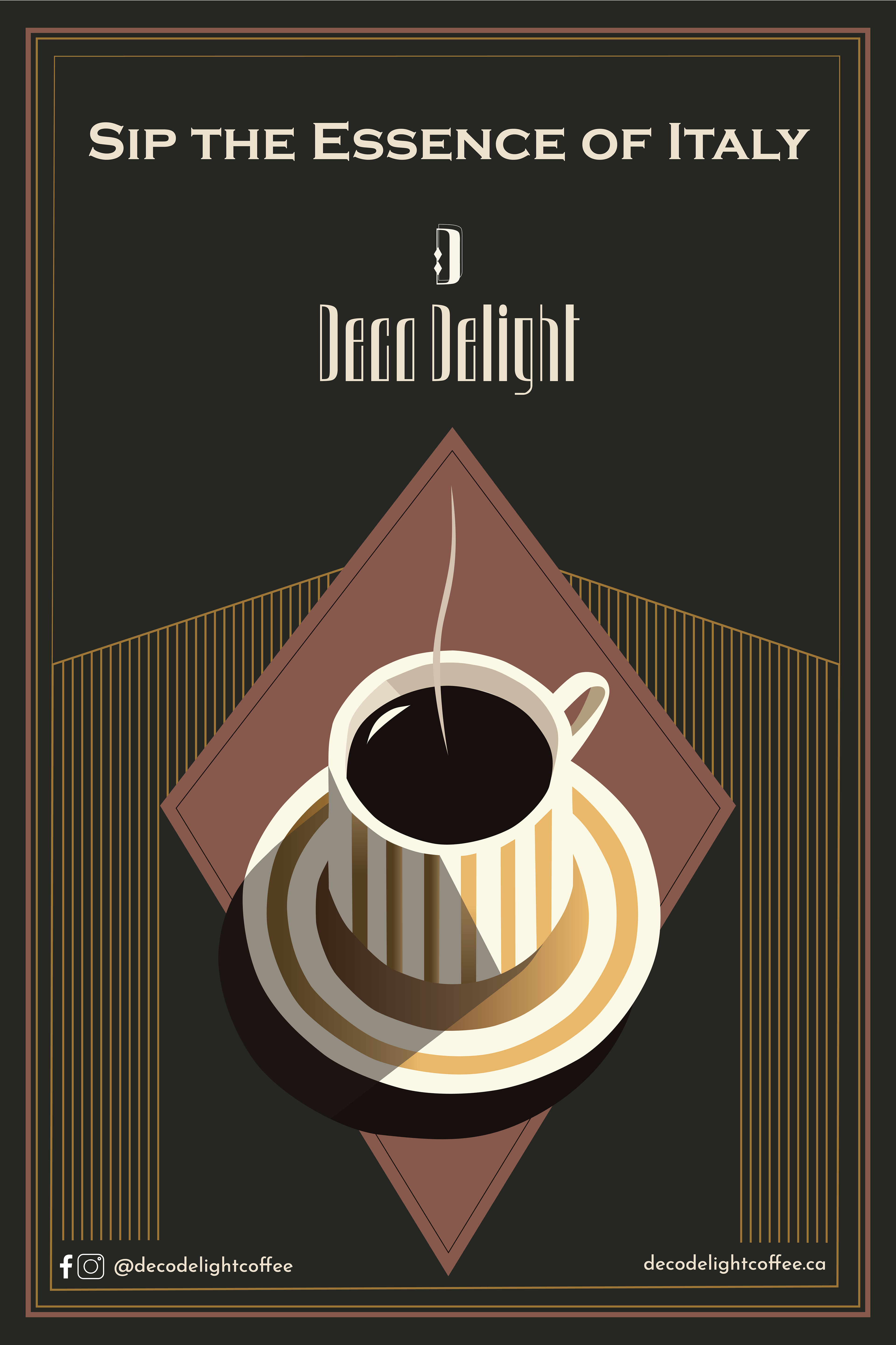
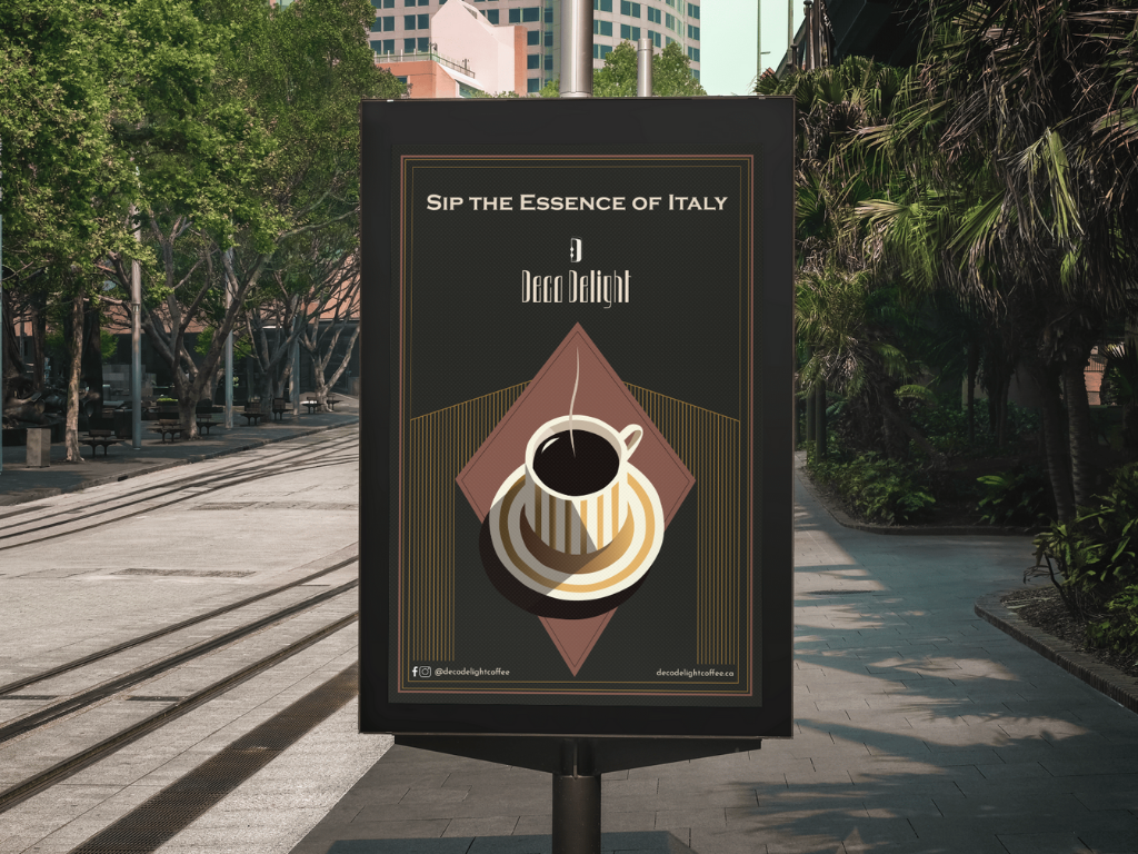
For the portrait print poster, I wanted to create that traditional ‘Italian cafe’ vibe to create a feeling of nostalgia and/or the desire for that authentic Italian cafe taste. It follows the same colour combinations and Art Deco patterns of the brand, to maintain brand identity and feeling. I also include the website and social media handles for those who want further information.
I designed a landscape layout ad using mockups to showcase the brewing process and highlight my three coffee roasts, each crafted for a different target audience.
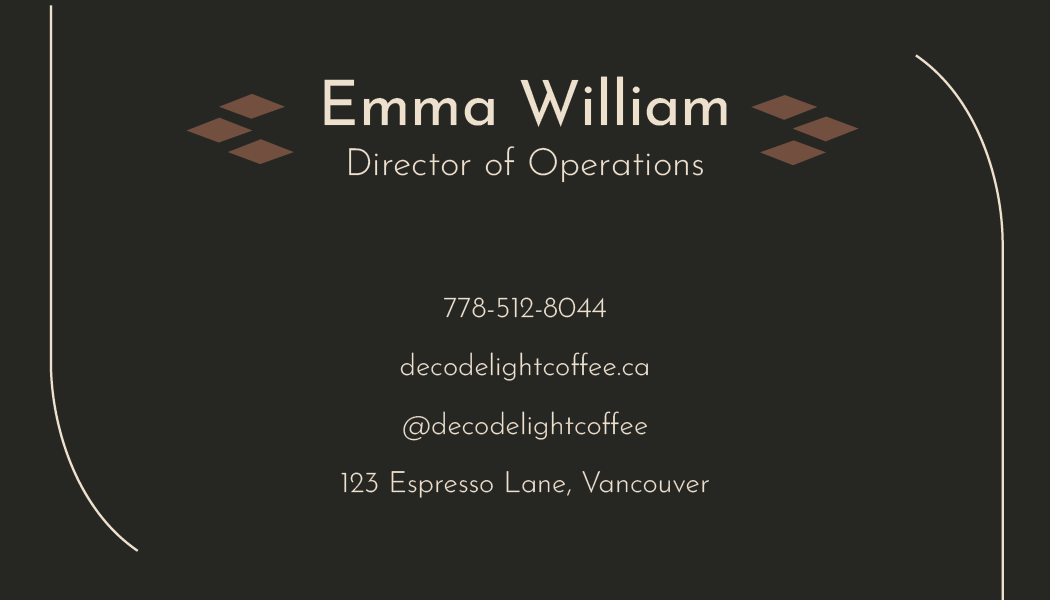
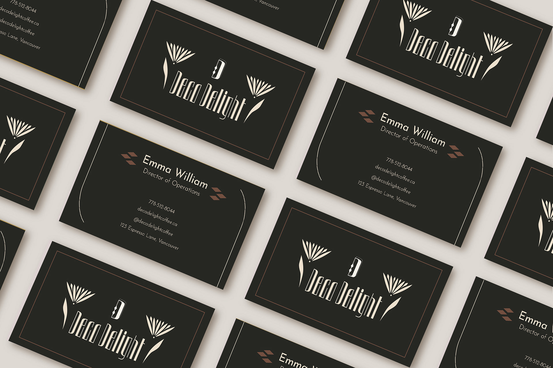
The business card is a centered and balanced double-sided card. It has a seaweed-coloured background and golden accents to give off a chic but welcoming feel for the card, preferably to be printed on ‘soft touch’ quality cards. The diamond coffee beans are used around the ‘name’ section as the person represents coffee (beans).
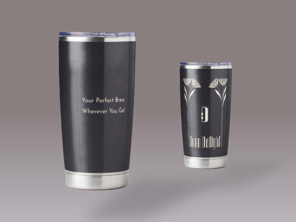
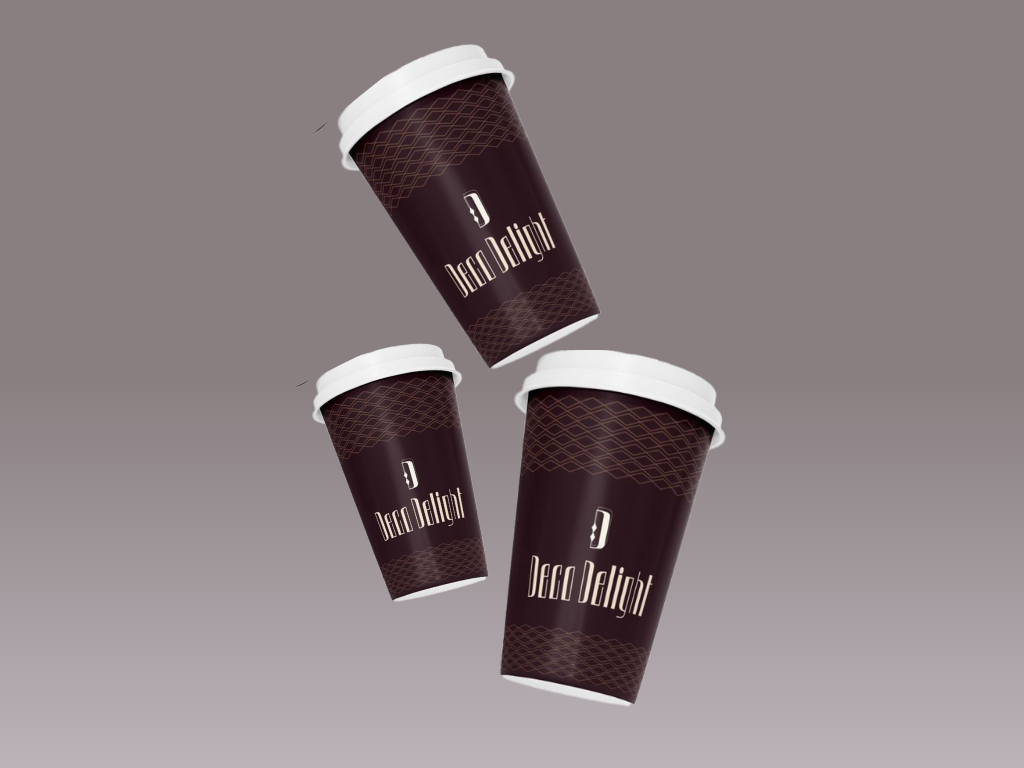
Deco Delight Coffee merchandise includes a coffee tumbler and take-out coffee cups. The tumbler includes a cute ‘coffee quote’ and an elegant unisex stone blue colour. The take-out cups feature a striking maroon base, with geometric diamond coffee beans, ensuring they catch the eye as people carry them around.
For this project I felt that packaging design and marketing were very important, and by focusing on the topics I noticed that I had lots of love and talent for creating innovative and cool packaging ideas in relation to a good marketing strategy.