Program Used: Adobe Photoshop, Adobe Illustrator
Spirit Wave is an immersive electronic music festival designed for those who want to flow with the rhythm, just like the ocean’s waves, and release all tension through progressive trance music, in a space of trust and freedom. The festival’s name, Spirit Wave, symbolizes the journey—where music becomes a current that carries attendees toward a euphoric, spiritual state. This once-in-a-lifetime event will bring together the world’s top trance artists for a transformative experience at the breathtaking Bali.
The deliverables I provided for this project were made through Adobe Photoshop and Illustrator; these deliverables include, concept development and branding, a print billboard poster, Instagram and Facebook Ads, and festival merchandise, all designed to capture the festival’s essence and its unique vibe.
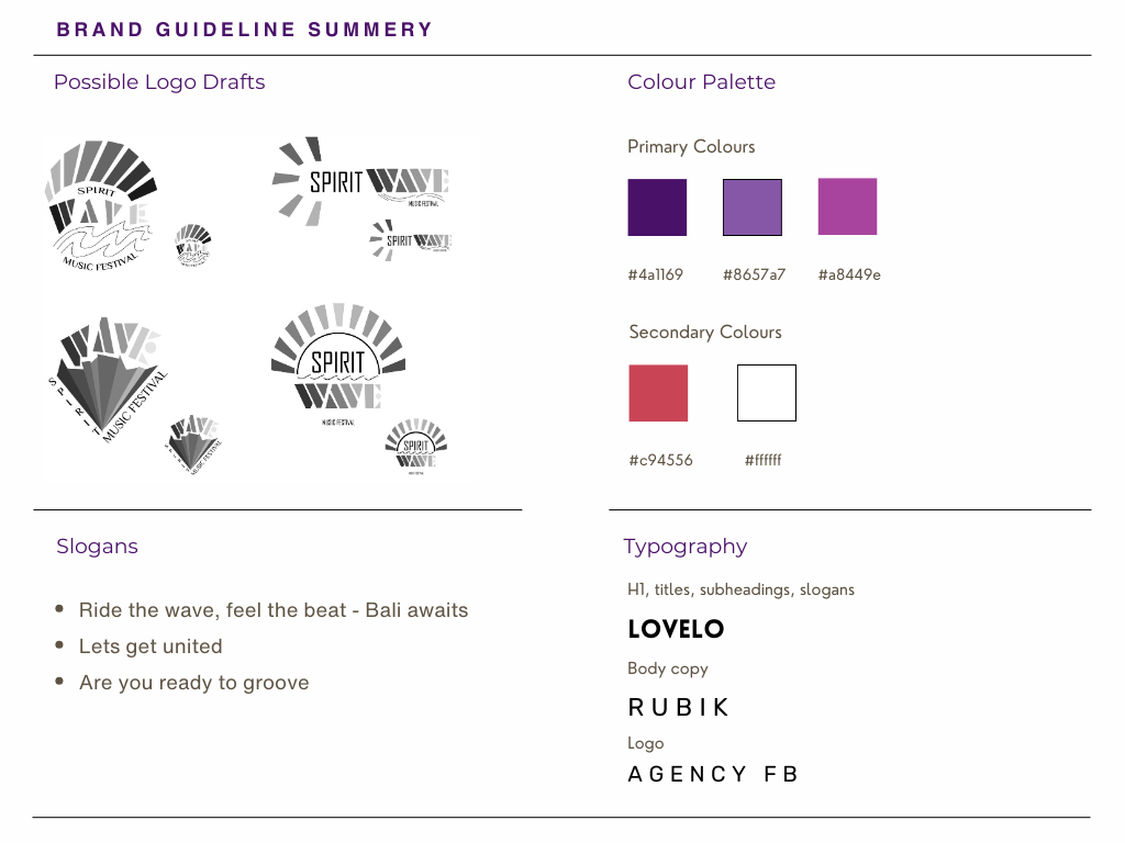
For the typography of the title, ad slogans, and subheadings I decided to use the sans serif fonts Lovelo and Rubic.
Lovelo bold, semi-bold, and regular weights typeface reflects modernity, aligning with the brand's goals. This font offers a clean, legible appearance, making it easy to read across both digital screens and print materials, ensuring consistency and clarity in every medium. Rubic is also a modern font used for the body copy to enhance readability and legibility while maintaining the overall clean and cohesive look of the designs.
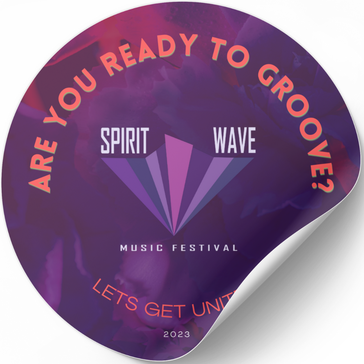
A complementary colour scheme is to grab the attention of the viewers. The different colour variations of purple are my dominant colours, as they combine the stability of blue and the energy of red. Orange and white are my accent colours to grab the viewer's attention to the title as well as important information.
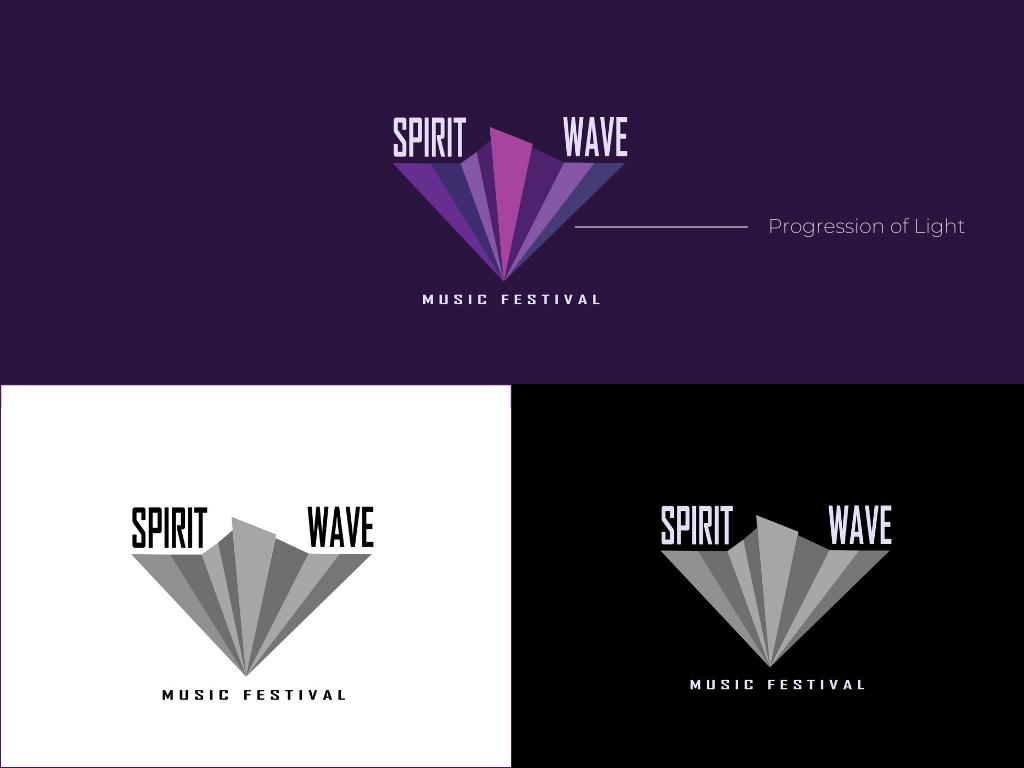
For my logo I did multiple sketches from paper sets to digital ones, afterwards, I would select the winning sketches and create vector files from them, then finish the final design within Adobe Illustrator.
The final logo is inspired by the progression of light which resonates with the mode of the festival. Purple is used as a primary colour and a monochromatic colour scheme creates more harmony for the logo itself and with the overall theme of the festival. Agency FB font was used for the logo due to its modern/futuristic looks that resonate with the trance community.
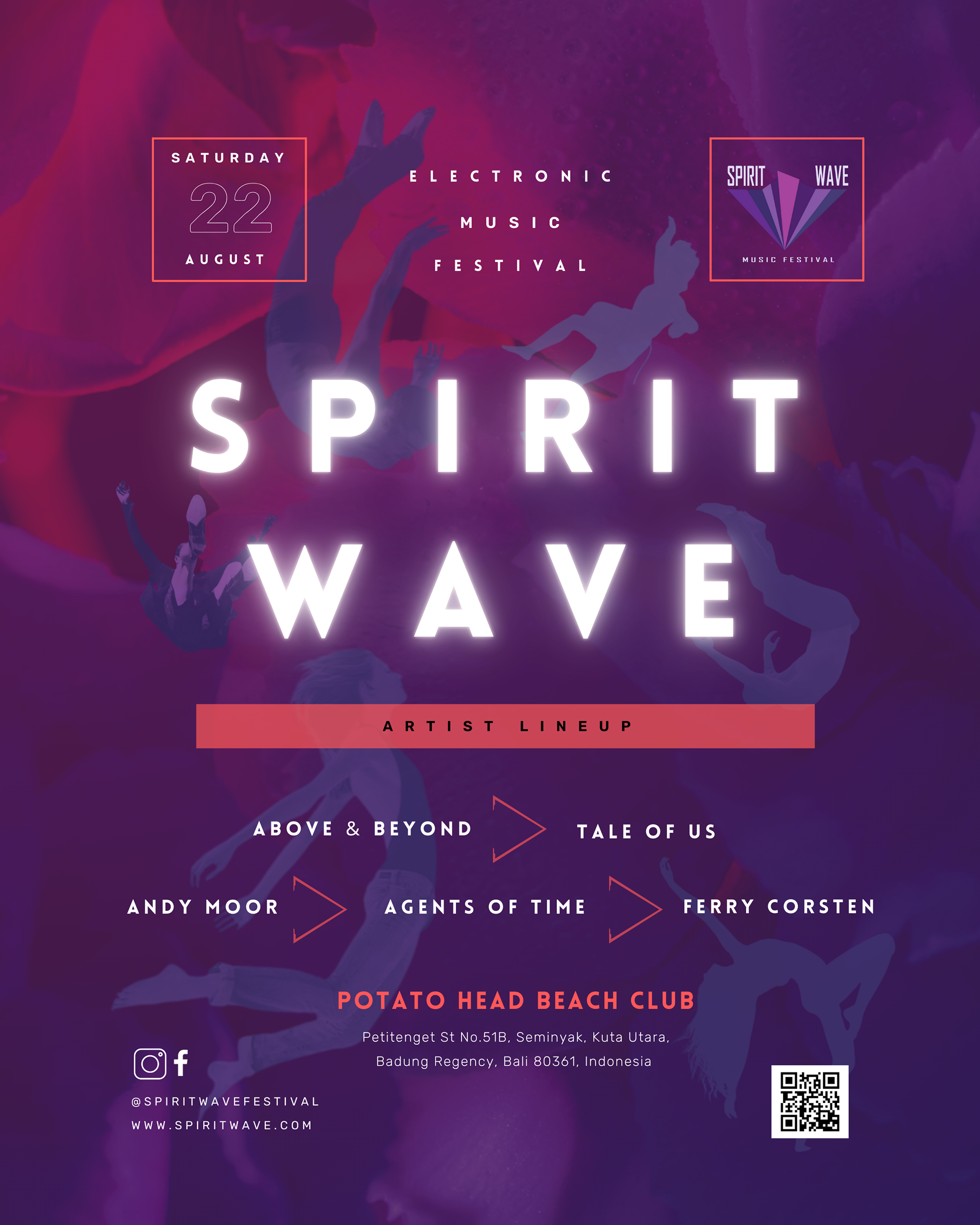
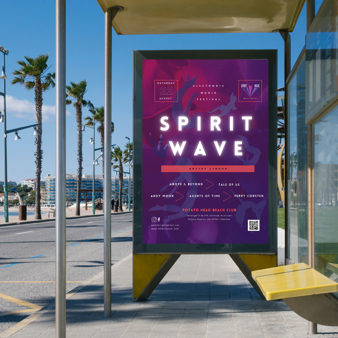
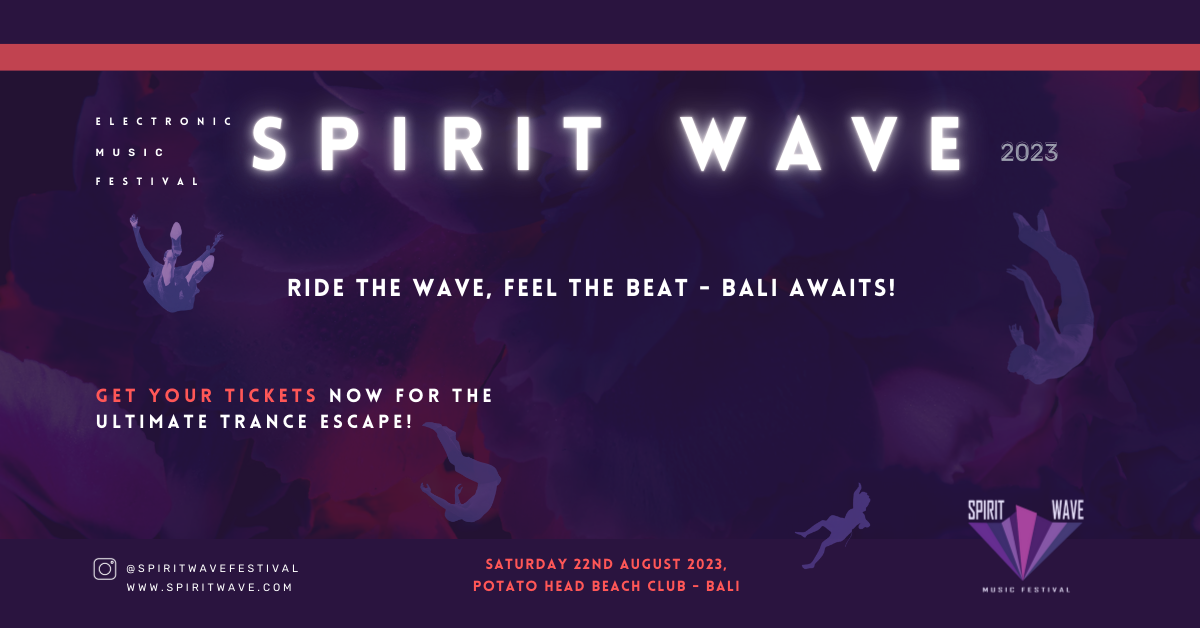
For the festival’s print poster, I set the focal point as the title, since it has a strong figure-ground relationship due to its high contrast and glowing effect which emphasizes the energy and concept of the music festival. My usage of the ‘free form’ figured people in the background are there to emphasize the euphoric emergence of the soul from the music.
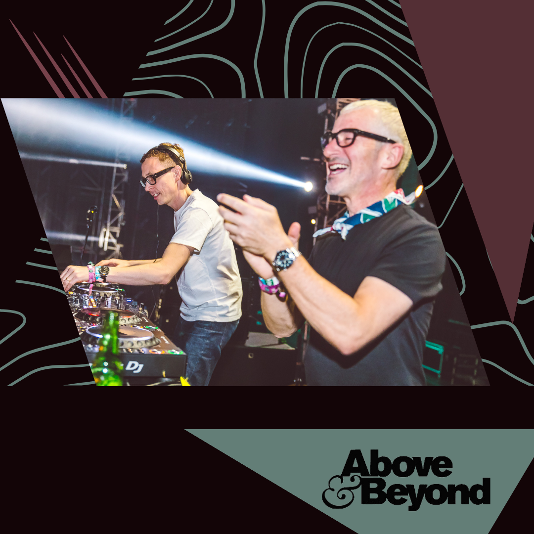
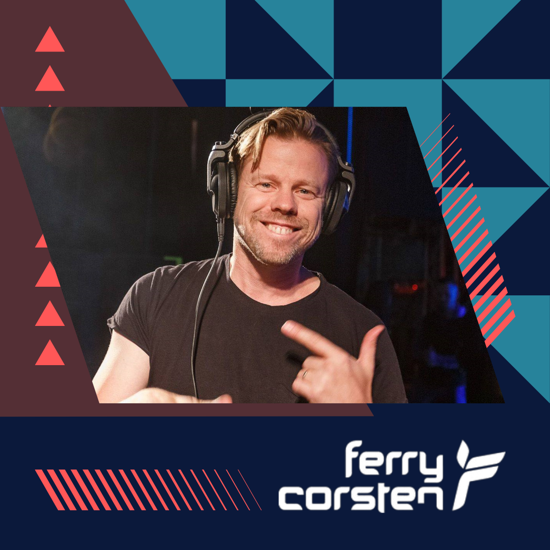
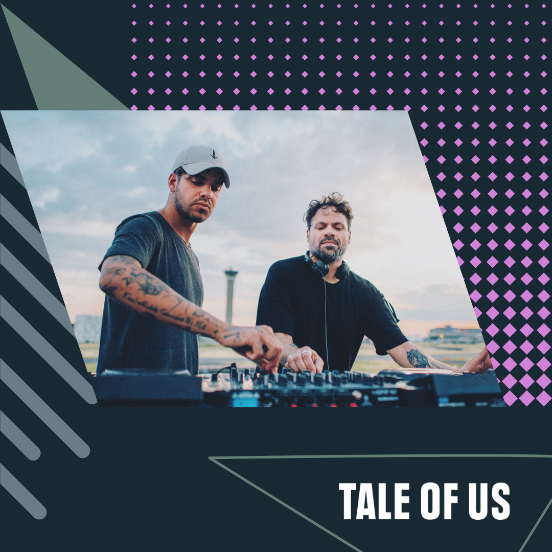
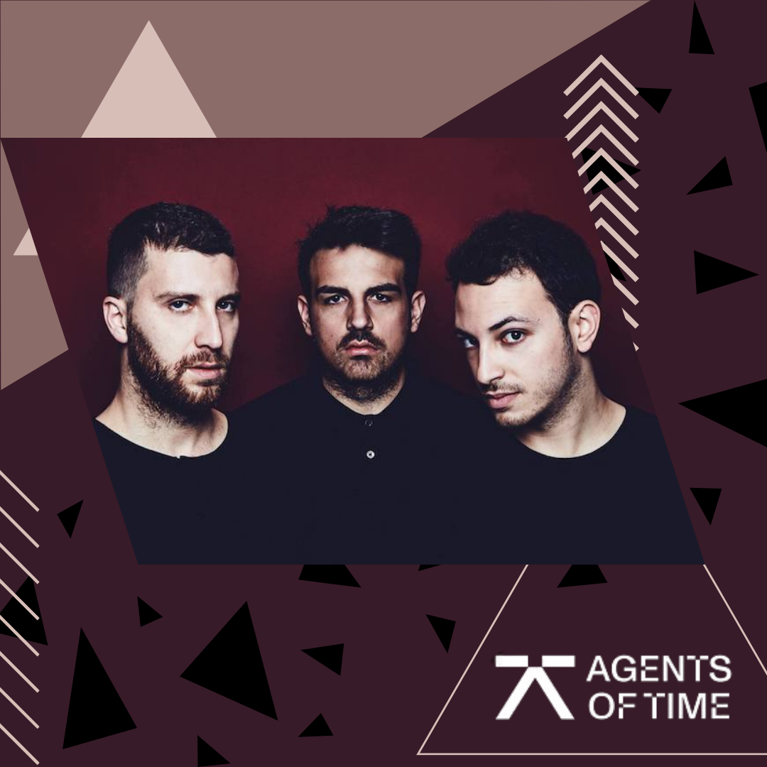
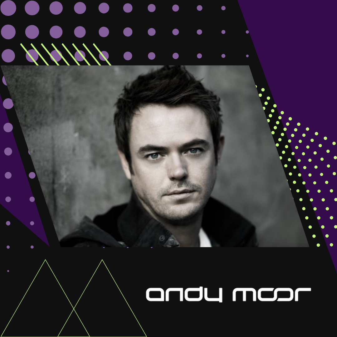
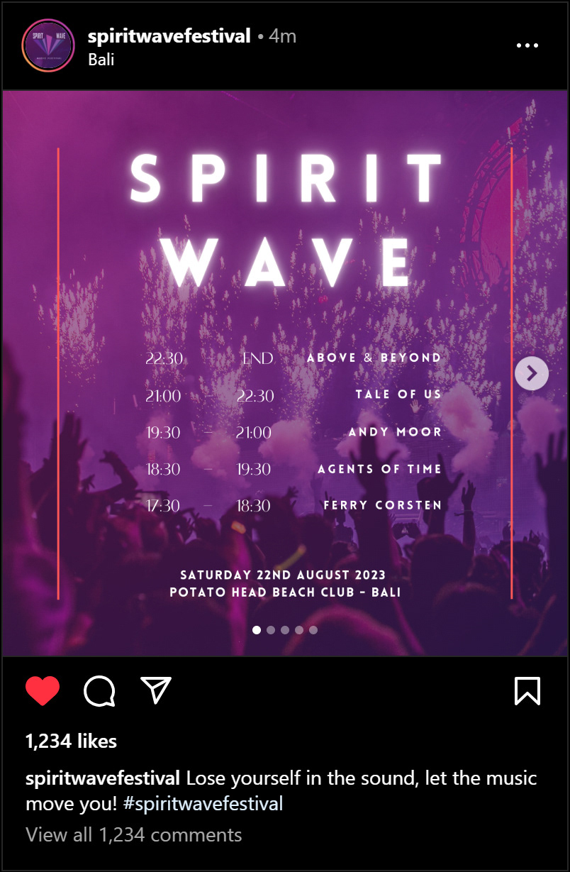
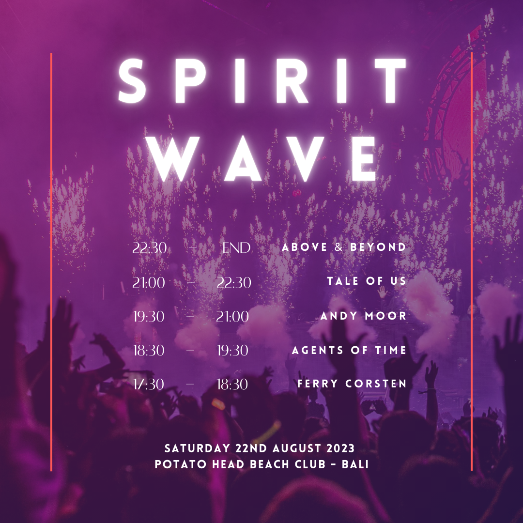
Looking at Instagram advertisements, I have a multi-paged post, where the first page covers the name and info of the festival and features artists with their set times. Following up would be five additional pages featuring each artist and their logo.
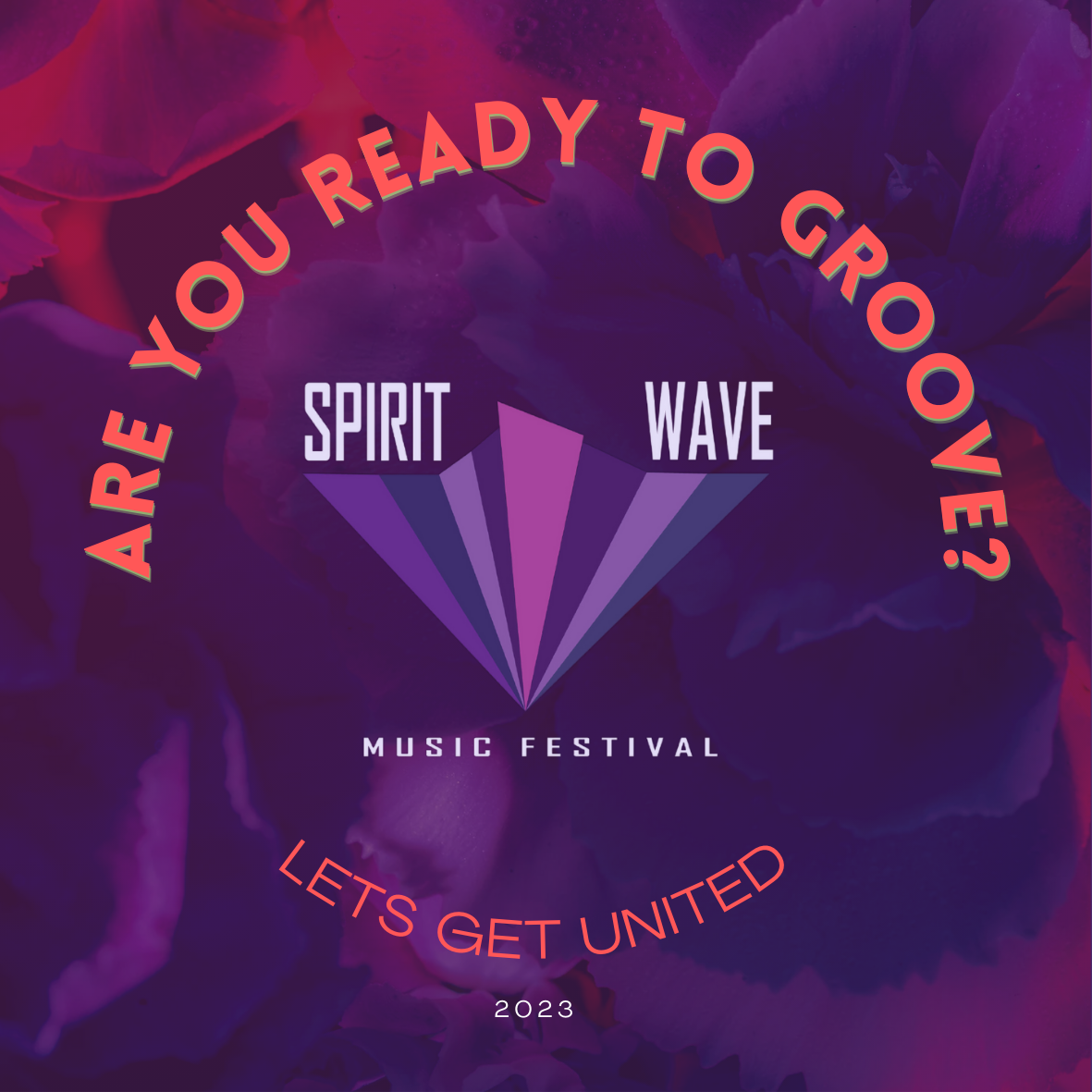
The Facebook advertisement is designed with a bright slogan to intrigue the viewers into checking out the festival by giving them a vibe/feel for the festival, with a clear CTA underneath to easily and clearly lead them to buy their tickets or get more information through social media or website.

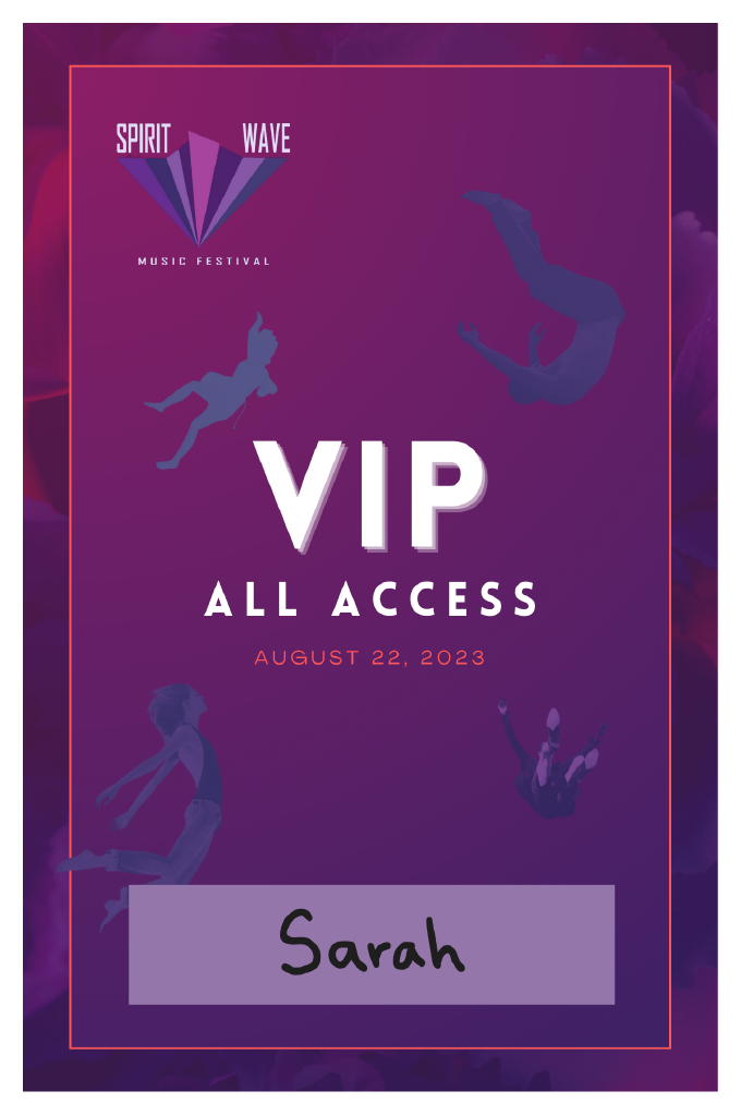
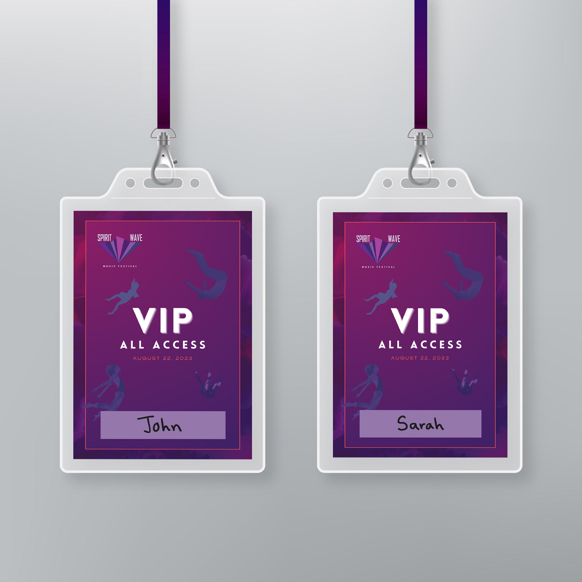
Festival merchandise, such as the Stickers and VIP access cards, are special gifts for attendees, serving as mementos of the festival. These keepsakes allow guests to take home a little piece of the festival and the memories they made during their time at Spirit Wave, keeping the festival’s memories alive while also being good for marketing purposes.
I enjoyed working on this music festival based project, as I am passionate about music and working with musicians/artists myself. I believe that the designs and art used at festivals are major factors that can affect the vibes, and atmosphere of the festival, and how they are portrayed.